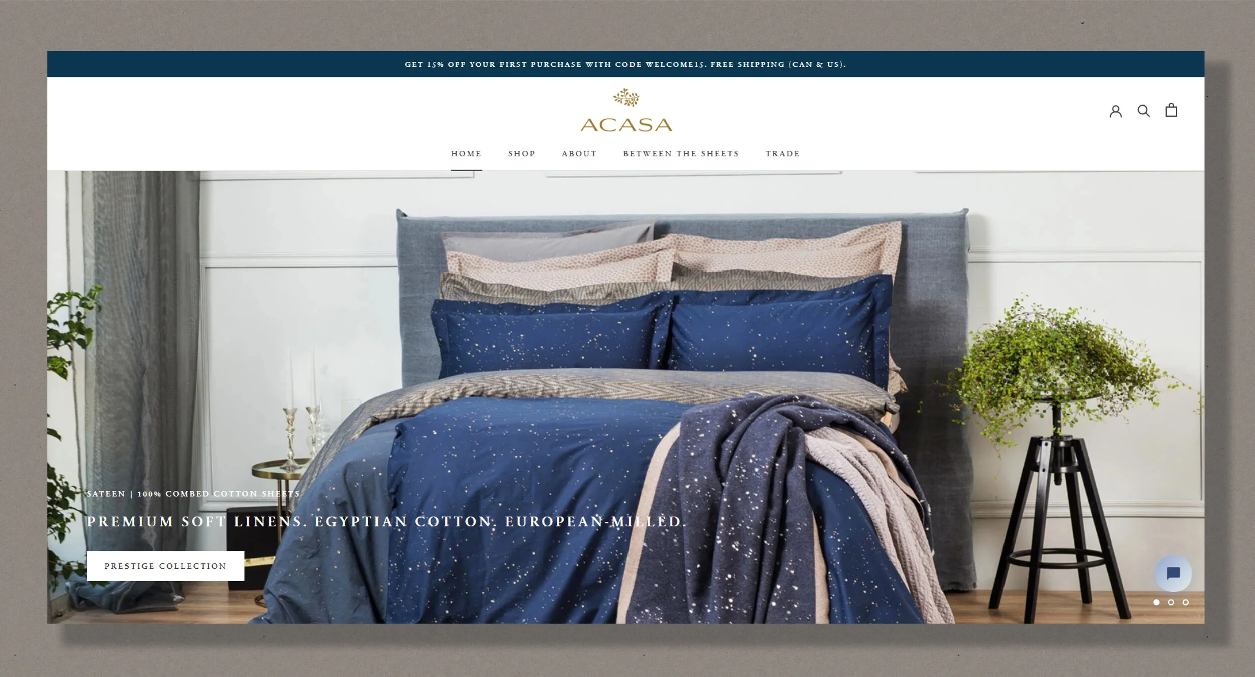
ACASA Home
GOAL
Design a responsive e-commerce website for a home decor brand and manage the social media pages
TOOLS
Figma, Shopify, Google Analytics, Hotjar, Instagram, Pinterest, Facebook, Klaviyo
MY ROLE
UX/UI Designer, Social Media and E-mail Content Manager
OVERVIEW
ACASA Home started as a personal project when I discovered a market opportunity for premium quality bedding that would cater to art and design enthusiasts. Interior designers and décor enthusiasts often use quality fabrics to enhance an existing color scheme and introduce extra visual interest and textural contrast. The goal was to create a responsive website and a digital brand presence that would be informative and appealing to my persona.
DESIGN PROCESS
In the early stages of the website design, I spent some time conducting competitive analysis, product research, and fabrics study, collaborating with the chosen manufacturers. These steps inspired the copy creation and informed the website information architecture along with the lo-fidelity sketches.


To help communicate the products’ value and position ACASA as a premium quality brand it was important to clearly explain what made the products unique. This was achieved through a comprehensive description of the materials and practices used in production. The “about us” section describing the business concept was complemented by detailed product information in the “about our sheets/ our blankets” sections as well as on individual product pages. The messaging was reinforced by scheduled posts on social media. I chose a refined color palette, type system, imagery, and animations based on the persona and her interests.

‘About ACASA’ and ‘Our Sheets’ pages
I wanted to bring the website visitors value beyond offering quality products. To keep website visitors engaged, I decided to offer the audience a regular blog of art and home décor stories and interviews.

“Interviews with Creatives” Series and Blog Section
SOCIAL MEDIA PRESENCE
According to data from SelfStartT, Instagram has become the top platform for brands to engage with followers that are willing to buy. On Facebook, only 32% of users engage with brands on a regular basis. When it comes to Instagram, on the other hand, 68% of users regularly engage with brands. Following Facebook and Instagram, Pinterest is the third-largest social network in the U.S. with two-thirds of the user base being women. According to a Pew Research study, the majority of Pinterest users have a disposable income. I wanted to ensure my users are being reached via the most relevant digital channels. As such, I decided to mainly focus on Instagram and Pinterest for content sharing and product promotion.
To ensure an overall visual language that reflects both the ACASA brand and the shared content, I combine product images with trending content from the art and design world. To reiterate, the art and design world is where the product patterns and branding took inspiration from.

Instagram feed
DESIGN CHALLENGES
Using third-party apps and e-commerce solutions proved challenging from a UX and UI perspective. The location of certain components, and the typography, and the color schemes offered by 3rd party plugins were not always customizable unless a premium plan was chosen. To overcome these limitations, I resorted to applications helping designers customize the e-commerce store with greater freedom and worked with the website developer to correct the technical glitches.
POST-LAUNCH REVIEW
Overview
After a year of online operations, I decided to revise certain sections of the website. I used Google Analytics reports showing the traffic data in aggregate, including the demographics, where the traffic comes from, devices used during check-out and where people left the site. Using the key findings, I decided to focus my research around the devices the customers used to complete the purchase, in order of importance: (1) desktop and (2) mobile.
I used a combination of anonymous user session recordings and user testing to check on-page interactions and discover the pain points.
Usability Testing
To better understand the user behavior and improve the interface usability, I decided to conduct one round of usability testing with five individuals. The tests followed the format of the Think Aloud Protocol Technique. The users were asked to complete a series of tasks evolving around (1) exploring the home page, (2) discovering the brand, (3) finding the difference between sateen and percale, (4) initiating the check-out, and (5) reading a blog post. The overall feedback was positive with a few common observations requiring immediate attention.
Key usability testing action items
Change the order of selected sections on the ‘Home’ and ‘About Us’ pages based on usefulness and refine the information hierarchy on content-heavy pages.
Remove visual distractions from the check-out page (chat FAB interfering with the call to action button) and ensure consistency of the chosen currency (when browsing and checking-out).
Refine the site map by changing the location of the page ‘How do you like to sleep’ from ‘Shop’ to ‘About our sheets’.

NEXT STEPS
Armed with knowledge gathered from the aforementioned testing phases, it is important to continue collecting user feedback and iterating the website. Short on-page surveys have been placed on the landing page and the key exit pages asking visitors about their experiences. Additional surveys will be sent to current and past clients to better understand their motivations and, factors that may have prevented them from placing an order. Creating heatmaps will provide an aggregated view of user behavior, showing how visitors have interacted with selected pages over time. Website heatmaps will help determine how much information gets seen or interacted with, and what elements are being clicked on or ignored.
KEY LEARNINGS
Seek user feedback early
Despite the extensive preliminary research that led to the MVP, user testing was conducted with a delay after the product launch. This resulted in a few usability issues that could have been avoided if usability testing was conducted prior to the product launch.
Mix research methods to enhance the overall findings
To complete this project, I am using both quantitative (intercept surveys, email questionnaires, clickstream analysis), and qualitative (usability testing, customer feedback) research methods. I found that combining methods is a great way to enhance the data, and inform and improve the chosen methods (e.g., create on-page surveys based on Google Analytics results).
